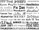
设计专用的高品质英文字体
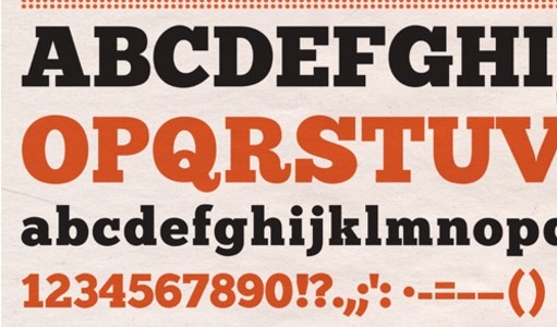
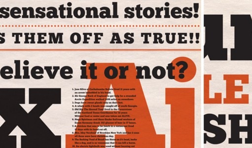
1.Chunk Open Source Typeface
Chunk is an ultra-bold slab serif typeface that is reminiscent of old American Western woodcuts, broadsides, and newspaper headlines. Used mainly for display, the fat block lettering is unreserved yet refined for contemporary use. OpenType. Designed by Meredith Mandel. (via Graham Smith).
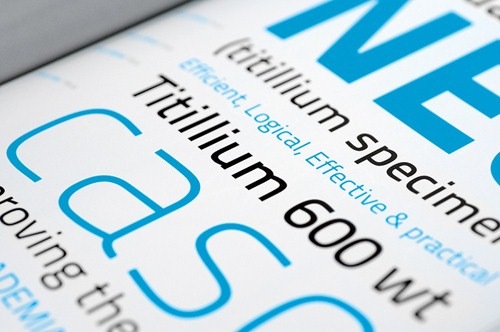
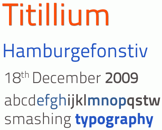
2.Titilium
A very legible, beautiful academic typeface that perfectly fits to every corporate identity design, magazines and headlines of corporate web-sites. The typeface is available in various weights: text version, title version, extra-black version and full-version.
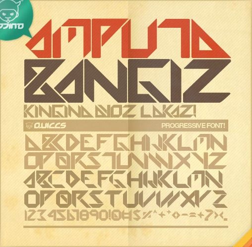
3.Amputa Bangiz Standard TTF
An original retro/grungy-font, designed by Quiccs and available for free download and use in private and commercial projects. Includes some basic non-alphanumeric characters as well.
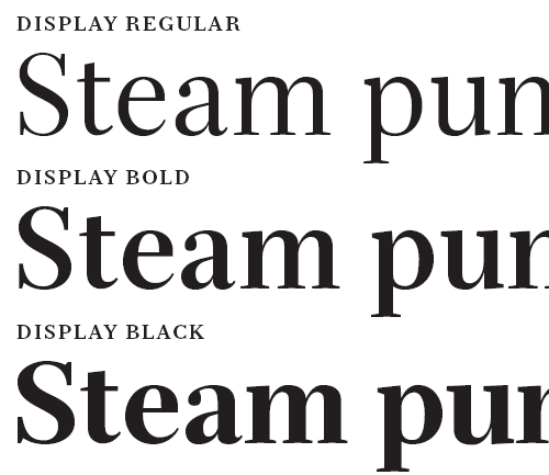
4.Serif Beta
Serif Beta is a very legible large serif family of free fonts, including 3 fontspacks with the optic weights 6, 12 und 72 (overall 14 weights). The family includes swash-glyphs and black-weights. Each font has 274 glyphs. Free for personal and commercial use, feedback is appreciated. (via dersven).
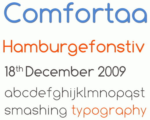
5.Comfortaa
Comfortaa is a simple, modern, legible true type font with 466 different characters and symbols (incl. European accents). Available in three weights: Regular, Bold and Thin. The typeface has smooth, rounded edges, Absolutely free for personal and commercial projects. Designed by Johan Aakerlund from Denmark.
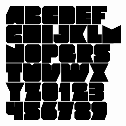
6.MOD™ font
Mod is an original, experimental font that is applicable for any type of graphic design – Web, print, motion graphics etc and perfect for T-shirts and other items like logos, pictograms. Designed by Svetoslav Simov from Sofia, Bulgaria.

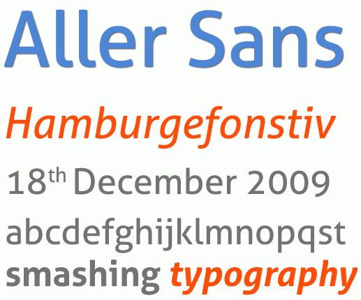
7.Aller Sans
Dalton Maag design team designed a beautiful sans-serif Aller Sans, sponsored by Danish publishing company Aller (hence the name). The typeface was designed as part of the Danish School of Media and Journalisms new CI and is now available for free use and download (via).
8.unction
Designed by Caroline Hadilaksono, Junction is a humanist sans-serif typeface. It has elegant, clearn and very sharp glyphs, but contains only 100 most common symbols. Like Gentium it perfectly fits to body copy, but can also show its strengths, balance and beauty in headlines. Here are some insights from the designer:
9.Droid Font Family
Google’s Android project, an open platform for mobile devices, includes the Droid font family, which was designed to provide optimal quality and comfort on a mobile handset when rendered in application menus, web browsers and for other screen text.
The Droid family of fonts consists of Droid Sans, Droid Sans Mono and Droid Serif. Each contains extensive character set coverage including Western Europe, Eastern/Central Europe, Baltic, Cyrillic, Greek and Turkish support. Description with a specimen. You can find concrete instruction of how you can use the fonts in this article.

10.Nilland
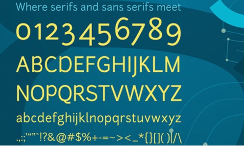
A beautiful slab-serif typeface, designed by Manfred Klein. The family consists of 6 weights, regular, bold, extra bold, black, small caps and small caps bold (link and images via DerSven.de).

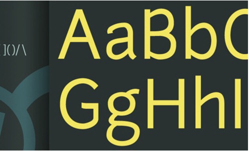
11.Vegur
This humanist sans-serif family is available in OpenType-format in three weights: ExtraLight, Regular and Bold. The typeface can be perfectly used both in body copy and in headlines.

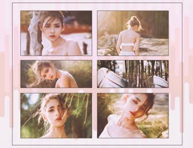
 情非得已
情非得已
-
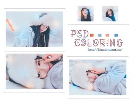
 人像添加暖色艺术效果PSD图层2017-12-27
-
 人像添加小清新艺术效果PSD图层2017-12-27
-
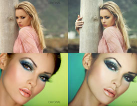 人像照片添加柔美效果PSD图层2014-12-04
-
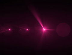 50个免费的高分辨率华丽镜头光晕打包下载2013-03-27
-
 45个人见人爱的手绘英文字体下载2013-03-25
-
45个人见人爱的手绘英文字体下载
相关素材29152013-03-25
-
 悦黑常规体-造字工房
相关素材66172010-09-14
悦黑常规体-造字工房
相关素材66172010-09-14
-
 悦圆常规体-造字工房
相关素材59182010-09-14
悦圆常规体-造字工房
相关素材59182010-09-14
-
 11款04系列像素字体
相关素材46732010-04-26
11款04系列像素字体
相关素材46732010-04-26
-
 12种中文常用设计字体
相关素材59382009-09-29
12种中文常用设计字体
相关素材59382009-09-29
